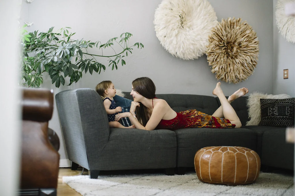
Living Room Design: How to Decorate With Your Baby In Mind
As I cleared off the bottom two shelves in living room, I remember feeling a mix of excitement and disappointment. I was excited because clearing off the shelves meant that Winter had reached a new milestone, crawling! Yet, I was a little disappointed because I knew that my days of displaying our collection of artisan goodies that we acquired on our travels, books, and other odds and ends would need to be put away for the time being. Because our living room at our old house was multifunctional and was often used as a playroom for Winter, it was the first room to be cleared out for our new crawler.
I know that it can be challenging learning to let go of the decor aesthetics in your house while you move and shift things around to make it safe for your baby, but it doesn't have to be!
When I met Anna, interior designer and owner from Anna Bode + Co., we discussed how one’s living spaces can be both aesthetically pleasing and child-friendly. I was intrigued by this concept and decided to start this series to show you how we decorate our house while keeping Winter in mind. It was amazing to watch Anna work her magic and create a space that could be enjoyed by the whole family. Caitlin owner of Zeal Living also came over and kindly gifted Winter some of her artisan goods to use in this photo shoot.
We hope you like what you see!
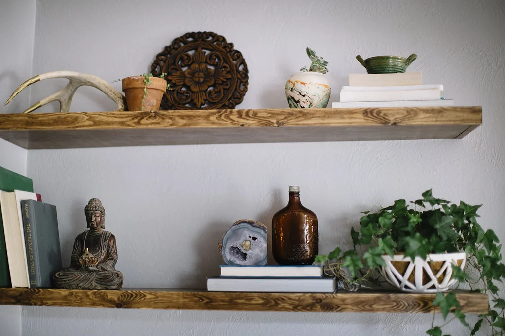
While the bottom two shelves were designed for Winter, the top three shelves were for Perry and me. The key to making these shelves appear cohesive was to stick to a neutral palate. We went with browns and cooler colors to create this vibe and, of course, added pops of green by incorporating plants.
Some of my books did not fit the "cooler color" theme so instead of going out to buy more, we simply turned them around.
The metal mobile hanging on the wall was placed there with Winter in mind. She loves music and can't get enough of it! She loves when I take down this mobile and wave it in front of her!
Ceramic Planter c/o Convivial Production Marble Planter (similar) & Agate Book Ends c/o Meek Vintage
The plant on top of the blue book is called a String of Pearls and is one our favorites.
*Tip: Add an interesting focal point by turning one book around in a collection.
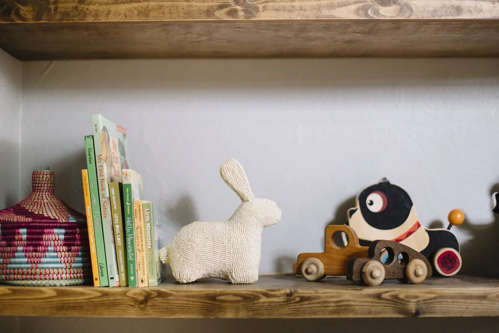
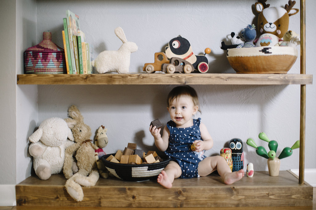
The fun really began while designing the bottom two shelves for Winter. What helped keep the rest of the bookshelf cohesive was again sticking to a cooler color palate and putting Winter's toys into containers and baskets that we would normally want displayed.
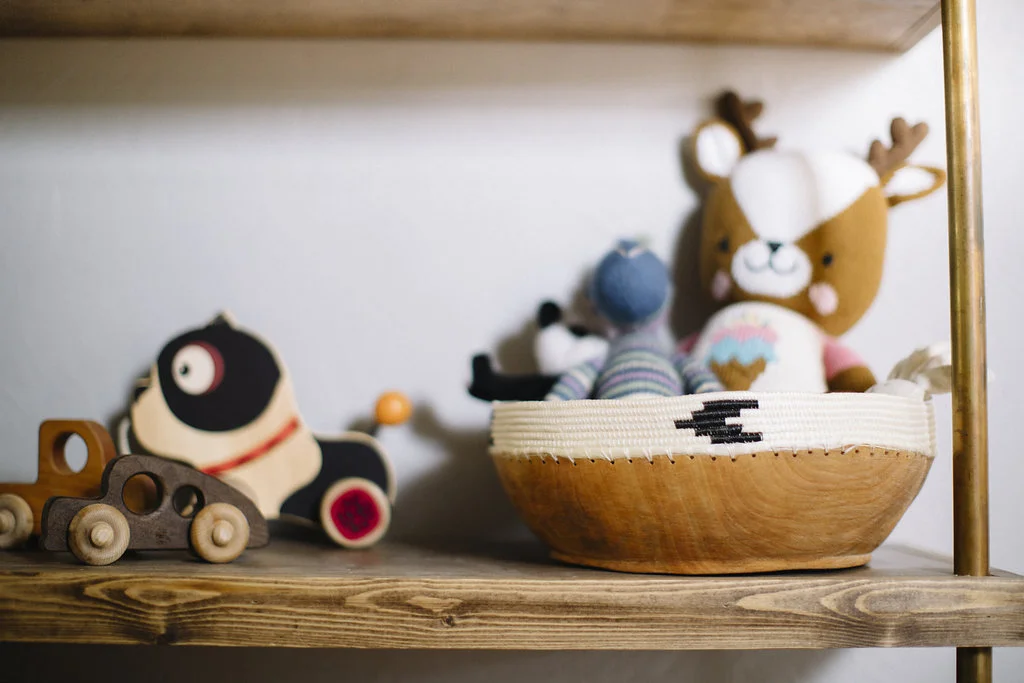
We also used a lot of wooden toys to complete the look. We wanted to make sure that everything on the shelves were items that Winter would want to play with but would also fit the design aesthetic. Of course we have more colorful toys for her, but we simply pop those into baskets or in the credenza (not pictured) and rotate them in when we want them.
The woven basket and wooden bowl are from Zeal Living. You guys, I am all about purchasing and promoting companies that do good for others, and this is certainly one of them. All of the products are made by African artisans and designers. The vision of Zeal Living is to see individual women and communities rise up out of poverty through the empowerment and dignity that comes with sustainable work. Your purchase allows artisans working for social enterprises to earn a living wage, and gives them access to training, support, health care, education, and inspired community. Seriously, you can't go wrong shopping here.
Space is limited in this room so we used a Moroccan pouf as our coffee table. It makes it easy to push out of the way so Winter has more room to move about. We also keep a lot of extra pillows on hand to put down on the hardwoods while she is playing on the shelves, just to be on the safe side :).
My biggest take away from Anna is that "less is more." I tend to want to jam-pack my space with knickknacks, but once Anna started minimizing the items on the shelf, the better they became. I will definitely be taking a more minimalist approach to bookshelf design from now on!
Photography by Brittany Renee'
Styling by Annabode + Co
A special thanks to the vendors that provided items for the shoot including but not limited to Zeal Living, Habitation Boheme, Meek Vintage, Convivial Production, Finn + Emma, Bannor Toys and Electric Sun Creatives. Thank you Anna, from Annabode + Co for styling this shoot. As always, all thoughts and opinions are my own.
